It is very nice penmanship. Nice to see skills like this still around.
Tangentially related, everyone should switch to fountain pens. I made the switch about two years ago and my handwriting has improved immensely. More aesthetically pleasing and sooo much easier to write. Your hand won't cramp anymore because you don't have to press nearly as hard. You'll find yourself naturally adding embellishments to characters, smoothly transitioning between letters and words.
It is very nice penmanship. Nice to see skills like this still around.
From the article:
It’s clear that it is mostly, but not completely handmade, as although the included paper is weathered all of the “handwriting” and calligraphy lacks the telltale pressure marks of actual handwriting.
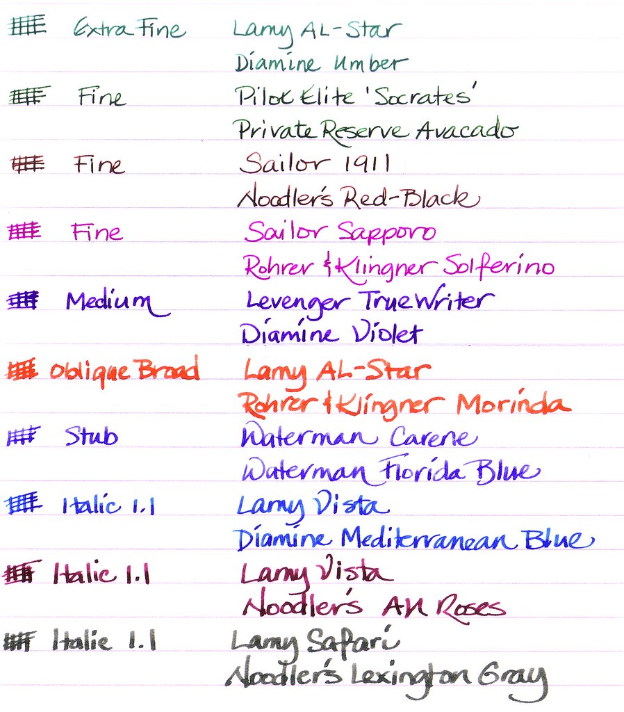
Fountain pens don't leave indentations on the paper, but there are often differences in ink density in parts of the letters or punctuation. This is much less noticeable w/ a fountain pen than it is with a calligraphic or dip pen, but still can be noticeable. [1]
Since these differences in ink density are caused by variations in nib speed and pressure while writing, I think that's what they were referring to by "pressure marks". For me, it seems to depend both on the pen and the paper I'm using. It's possible that what you use doesn't show much of this effect at all. (I also use too much pressure with a fountain pen, which likely deposits more ink and hides effects like this.)
I print handwriting. I use a Wacom-enabled digital notebook for taking notes in class because it syncs with Evernote which means I can study anywhere from any device. I take handwritten notes on it, and print them if I need to distribute something I wrote/drew.
I don't know if that's how this person did it, but that's one way it's possible.
So what's a good pen to start with? It's not clear to me if you mean the ones (disposable?) which you can just buy at your average office supplies place, or a fancier one intended for refilling, etc.
Something like a Lamy Safari or Al-Star is a good place to start; they're inexpensive (as fountain pens go) and basically indestructible, and you can either buy ink cartridges or a converter that lets you fill it out of a bottle.
Exactly this. I started with a Lamy Al-Star and it's a nice, robust little pen for pretty cheap. Aluminum, so it can take being thrown around. My girlfriend recently started using the Safari and it's a good pen too.
My main "workhorse" pen is the Lamy Studio. Heavier than the Al-Star, a slightly grippy coating, better balance when "posted" (putting the cap on the end of the pen while writing). Also a bit thicker, which suits my personal preference.
I have a few other cheap chinese fountain pens that I mess around with, but mostly stick to my Studio.
Edit: Bonus points to owning a semi-nice fountain pen: you'll never lose a pen again. I religiously keep mine in my pocket because, damnit, I spent a lot of money on this pen! No more losing your 20 cent Bics and frantically trying to find a new writing implement.
Thanks. I'm left-handed and I've never been happy with hand-writing. My death-grip on the pen inevitably results in a vicious cycle of hand cramps and messy handwriting.
I've been looking to change things up by taking hand-written notes (less distracting overall, more focus), but I'm back to the same old. A better writing instrument might help.
Switching to using a fountain pen has made my left-handed writing much better, mostly because I have to slow down and think about how I put the pen to paper, rather than just scrawl it along.
Lamy do left-handed nibs which help a lot. I'm very happy with my Lamy Safari, but I also have a Schneider Base which works well.
Being left handed, you may have to experiment with paper and ink. Some inks, usually archival quality, take longer to dry and you may smear them. Less archival quality inks soak up faster, especially with more "open" paper that sucks it up.
I can second the Lamy Safari suggestion. I found the Safari to be extremely reliable: always starts right away (even after weeks of not writing), never leaking (even in planes and or if I shake it), and needing very little pressure to write.
It might not be the smoothest or the prettiest for its price, it's stiff as a nail but its reliability made it an everyday writer for me.
While Lamy is fine, it's bit drab looking. If you want a nice pen (both in terms of looks and in terms of writing), look at Taccia pens. They've got nice ones in the $70 range. (Here's my latest baby: http://www.amazon.com/gp/product/B002KDP9Y2/ref=oh_details_o...)
I'll second the Varsity pens. I've bought, used up, and lost several of the Varsity pens. At $3/each, it's still less than having bought the Lamy pen mentioned above (which, btw, is considered an excellent starting pen), and in the process I've been able to write with a fountain pen for about a year. I like it a lot. One down side is that Varsity pens have ink that is not waterproof, and now that I live where it rains, I need something that lasts better.
Also, most notebooks or pads of paper in the office will absorb fountain pen ink like a 5 year old drinks chocolate milk, which makes your writing look terrible. The fountain pen forums linked above, and many blogs, have reviews about various types of paper. I found that I __really__ like the feel of the Staples sugar-cane paper. It feels nicer to write on than anything other than drafting vellum, so far, and is not very expensive. The notebooks are spiral-bound, but you can also buy it in reams, I believe.
I also tried another disposable fountain pen from The Other Brand (I forget the name?), and it seemed roughly similar to the Varsity. The clip on the cap was less flexible, though, and broke. I wouldn't have that problem with a more expensive pen, I imagine.